Visualize
Visualize your AWS usage with a pie chart
Click the Visualize tab, then Create a visualization.
You can see that Elasticsearch provides a number of different visualizations for underlying data. Click the Pie chart.
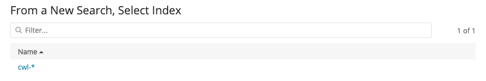
On the following screen, you tell Kibana which index pattern to use as a data source for the visualization. We’ve only set up one. Click cwl-*.
Congratulations! You’ve made your first visualization. Unfortunately, it’s not showing anything useful at present. It’s just a pie chart of everything. To set the slices, you need to select a field that you want visualized.
Under Buckets, click Split Slices. This will reveal a new menu, Aggregations. From that menu, choose Terms (You might have to scroll the menu to see it, it’s at the bottom). Click to drop down the Fields menu and the search box. Type awsRegion.keyword in the search box, and click its item in the menu. Finally, click
 to apply the changes.
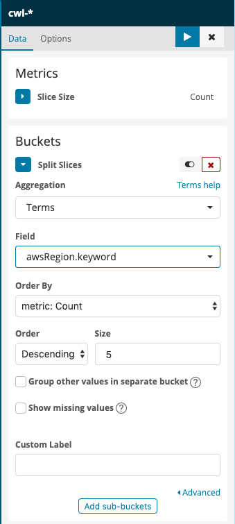
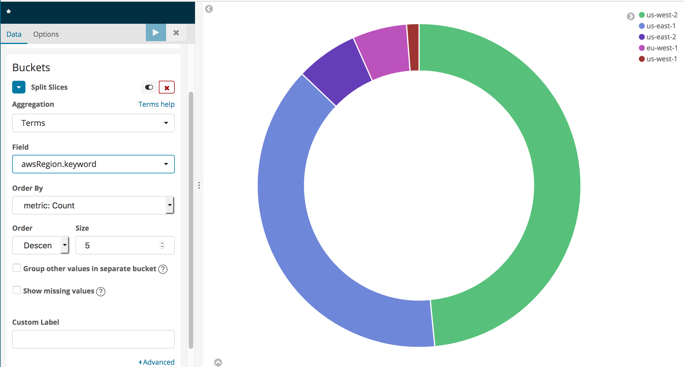
This will give you a more informative pie chart that shows the regions for the CloudTrail logging data (The Lab Accounts only have entries corresponding to us-east-1).
You can experiment with adding a search term in the search bar above the visualization. For instance, to see a regional breakdown of Amazon Elasticsearch Service API calls, type eventSource:\“es.amazonaws.com\“. Your pie chart will change to show only calls matching the search term – that is, calls to Amazon Elasticsearch Service. Clear your search by changing the search text to *.
You can also see a service and call breakdown by region by clicking Add sub-buckets at the bottom of the left rail (you might have to scroll down to see it).
Click Add sub-buckets, then choose Split Slices again. Select Terms as the Sub aggregation and eventSource.keyword as the Field. Apply the changes to see which services you are calling in the regions displayed.
Add another Terms, Sub-bucket for the userIdentity.accountId field.
You can work with textual data using Terms aggregations in a number of different forms: Pie Charts, Histograms, Line Graphs, and more. Experiment with the different Fields in the domain to see what you can generate.
You can also save your visualization and build it into a dashboard. Click Save at the top of the screen. Type Pie Chart by Region as the Name.
Visualize call volume by region
Select Visualize in the left rail.
You will see your saved visualization. Click the
 to create a new visualization.
Scroll down, and select Visual Builder.
You will see a time-based graph of all of the calls logged by CloudTrail. Drop the Group By menu and select Terms.
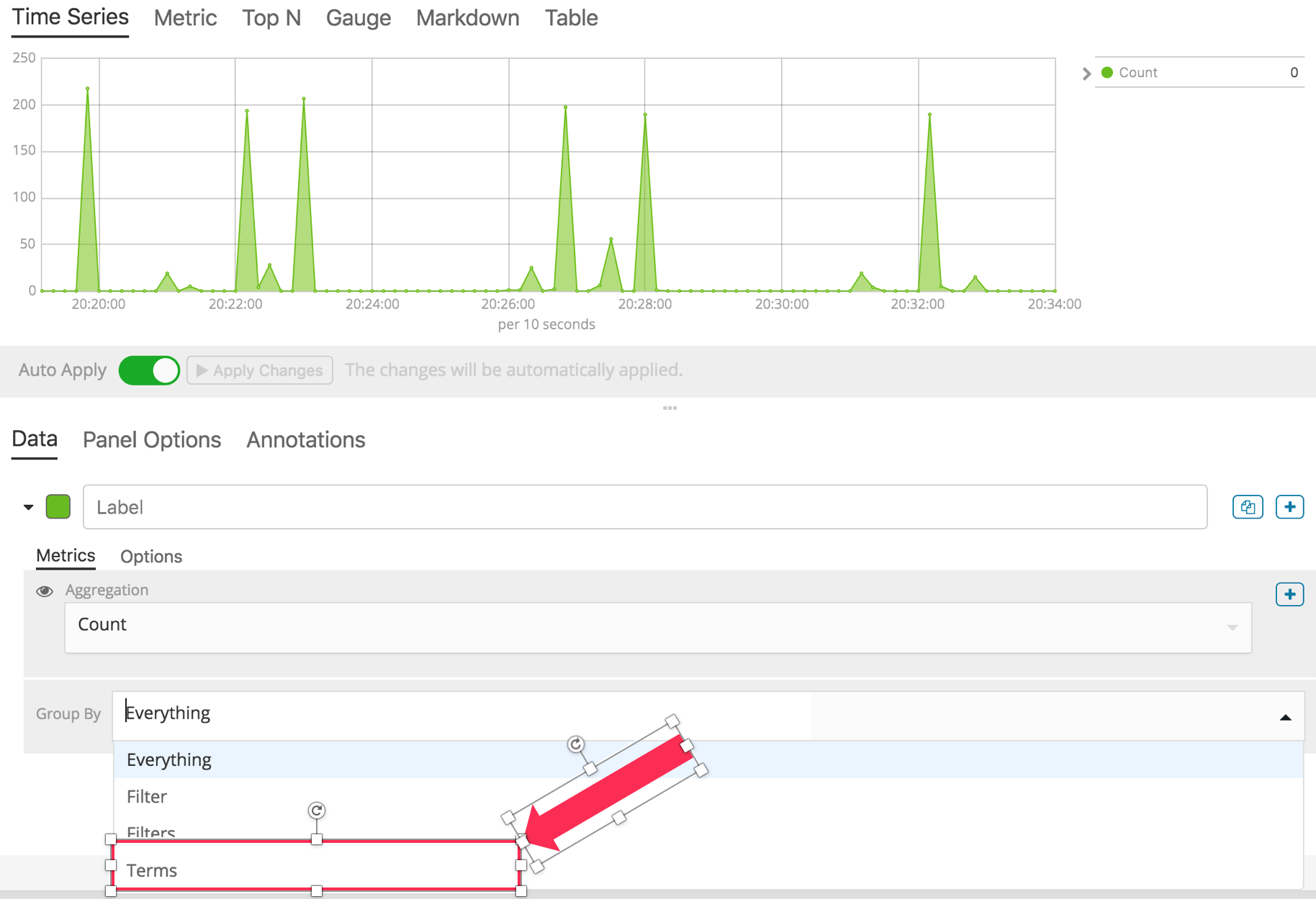
For By, use the search box or scroll to select awsRegion.keyword. You now have a graph of calls logged by CloudTrail, by region.
Click Save at the top of the screen to save your visualization. Name it Calls by region.
Add real-time updating
Click
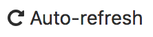 at the top of the screen.
Choose a Refresh Interval. 30 seconds or more are good choices.
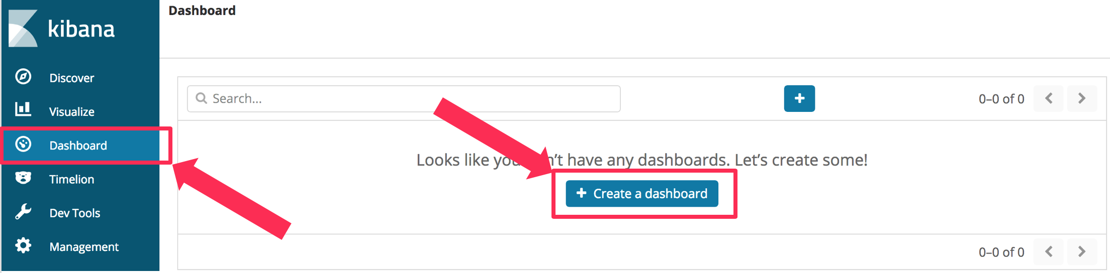
Build a dashboard
Select the Dashboard pane, and choose Create a dashboard.
Click the Add button
Click Calls by Region and then Pie Chart By Region.
Click the Add button at the top of the screen to collapse the Add Panels pane.
You can adjust the size and position of the panes. You can also Save your dashboard so that you can open it next time you use Kibana.
[OPTIONAL] Generate traffic to S3 and monitor it
For further investigation, we have also created a CloudFormation template that creates a Lambda function to put random keys to S3. You can use CloudTrail to capture and stream read and write events to this bucket. You can use Kibana to create a visualization to monitor these events. If you don’t want to follow these steps, skip down below to the Cleanup section.
Navigate to the CloudFormation console (Services menu, search for and select CloudFormation).
Click Create Stack
Choose Specify an Amazon S3 template URL and paste the following URL in the text box
https://s3.us-east-2.amazonaws.com/search-sa-log-solutions/cloudtrail/S3-Traffic-Gen-Lambda.jsonClick Next.
Enter a Stack Name and a Stack Prefix (I used s3gen for both)
Click Next.
Scroll to the bottom of the Options page and click Next.
Scroll to the bottom of the Review page, Click the check box next to I acknowledge that AWS CloudFormation might create IAM resources with custom names.
Click Create Stack.
Wait until the stack status is CREATE_COMPLETE. Now you need to enable logging S3 events.
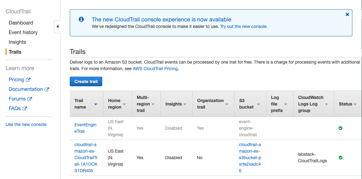
Navigate to the CloudTrail Console (Services menu, search for and select CloudTrail).
Select Trails and find the trail generated by the first stack, above. Click the trail’s name to open its configuration page.
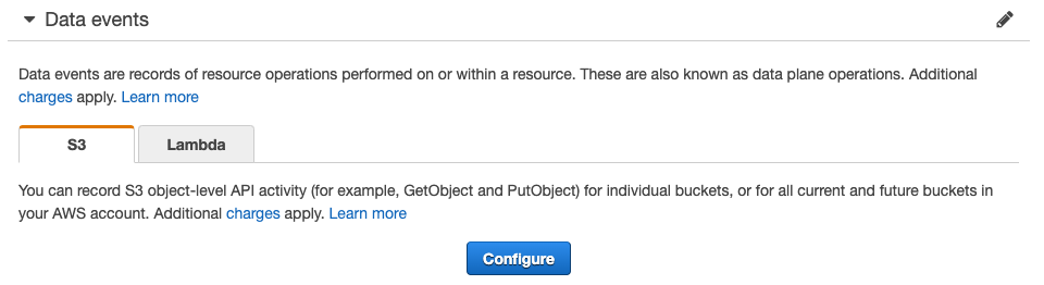
Scroll down to the Data Events section and click Configure.
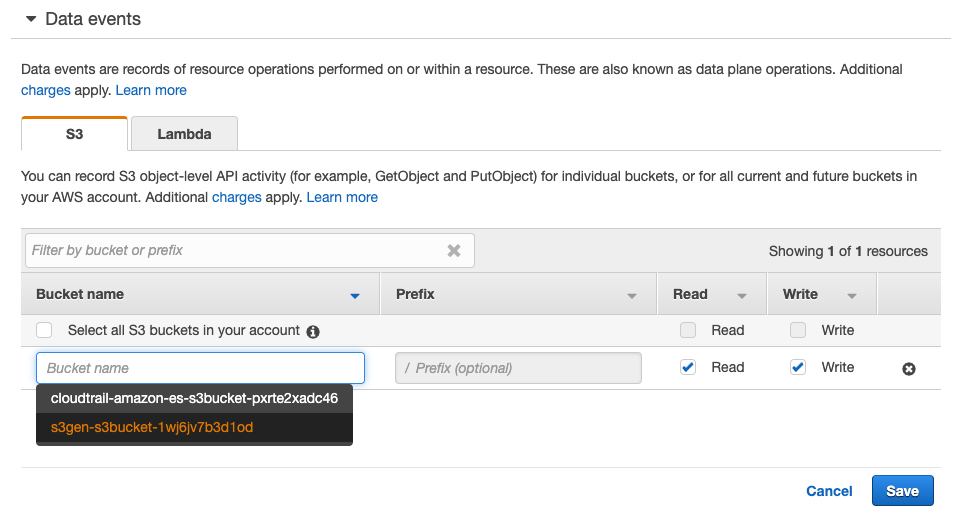
Click Add S3 Bucket
In the Bucket name text box, start typing your stack prefix from the second stack until you find your <stack prefix>-s3bucket-<uuid>. Select it.
You can choose to enable Read or Write events or both.
Click Save.
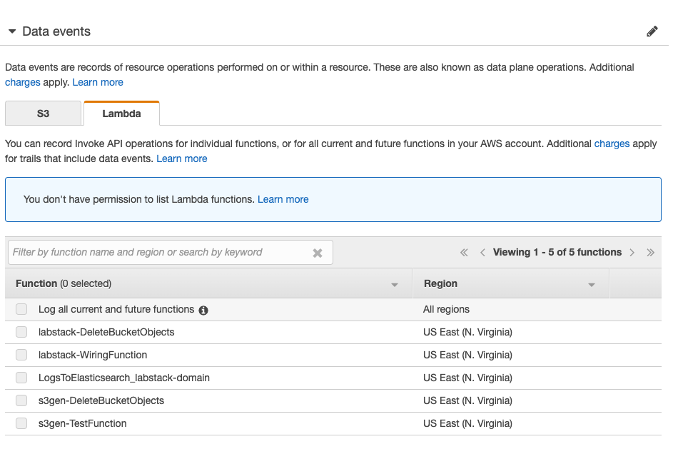
Note, you can also configure Lambda data events by selecting the Lambda tab and configuring it.
Navigate to the Lambda console (Services menu, search for and select Lambda)
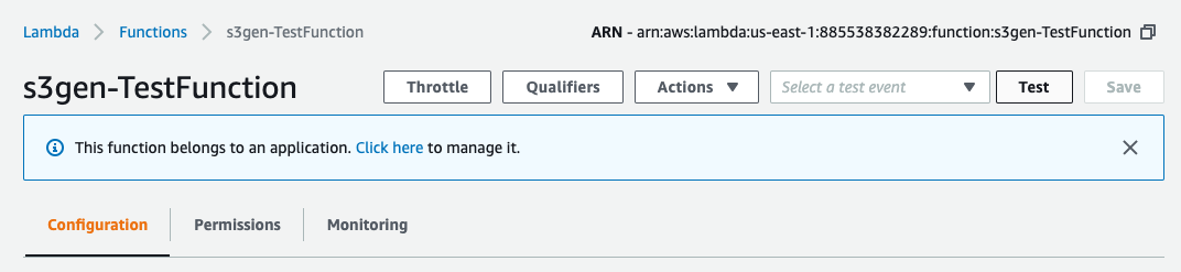
Find the function named <stack prefix>-TestFunction. Click the function’s name.
Click the Test button.
Give the test data an Event name. You can leave the default values. Scroll down and click Create.
Click the Test button again. The Lambda function will run for 5 minutes, creating objects in the S3 bucket.
[OPTIONAL] Visualize S3 data events
In this example, you’ll create a time-based line graph, scoped to a particular search query.
Navigate back to Kibana. You might have to wait for the objects to arrive in your Amazon ES domain. (You can use the search bar and search for PutObject to find these events)
Click Visualize and then click the
to create a new visualization.Create a Line graph.
Click cwl-* as the Name.
Set the X-Axis to bucket by time. For Bucket, click X-Axis.
For the Aggregation, select Date Histogram. You now have time buckets along the X-Axis, and the event count on the Y-Axis. This is a very common graph to create. You can change the Y-Axis settings to graph sums, averages, etc. for numeric fields.
In this case, we want to graph GetObject, PutObject, and DeleteObject separately on the same graph.
In the X-Axis section, click Add sub-buckets.
For the Buckets type, click Split Series.
For the Sub Aggregation, select Filters from the menu.
In the Filter 1 box, type eventName:\“GetObject\” (with the quotation marks).
Click the Add Filter button.
In the Filter 2 box, type eventName:\“PutObject\”.
Click the Add Filter button.
In the Filter 3 box, type eventName:\“DeleteObject\”.
Click
 to make the changes.
You will not have any GetObject or DeleteObject events at this time. You can go to the S3 console and click a couple of the keys, and delete a couple of the keys to see those events